Ranking allows you to compare the situation of your street or street segment with other streets. You can compare each street with other streets in your own neighbourhood or, via your own private dashboard, based on your own street profile.
The street profile, which you can define in your Dashboard, shows the main characteristics of your street. Make sure to fill out your street profile to make the most out of the ranking tool.
Please note that ranking makes use of typical traffic data. See the topic on the types of Telraam data for more info.
Where can I find the ranking tool?
You can access the ranking tool in two ways:
- Via the home page of www.telraam.net. Click on your street segment, then on “More details” on the bottom right of the screen.
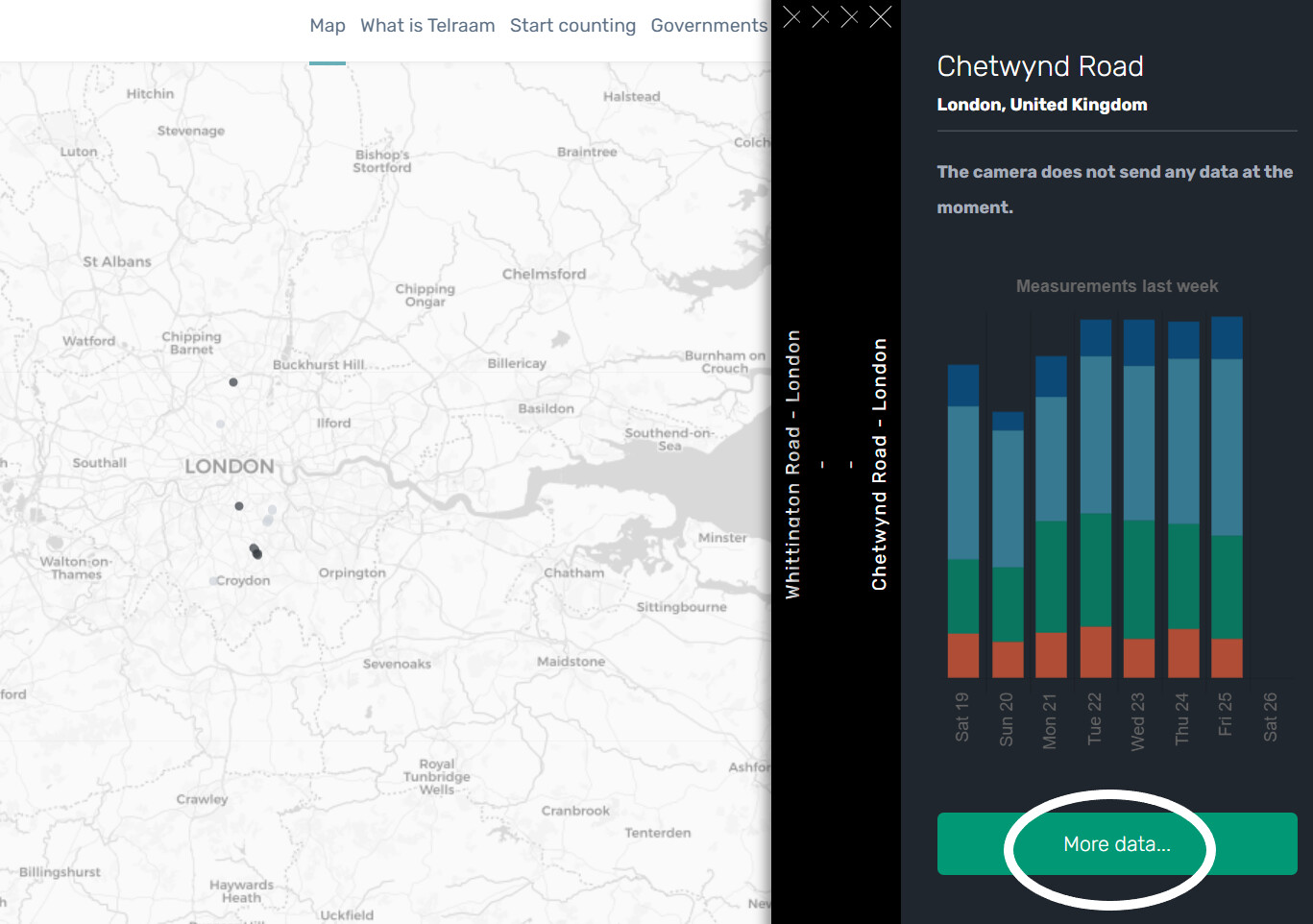
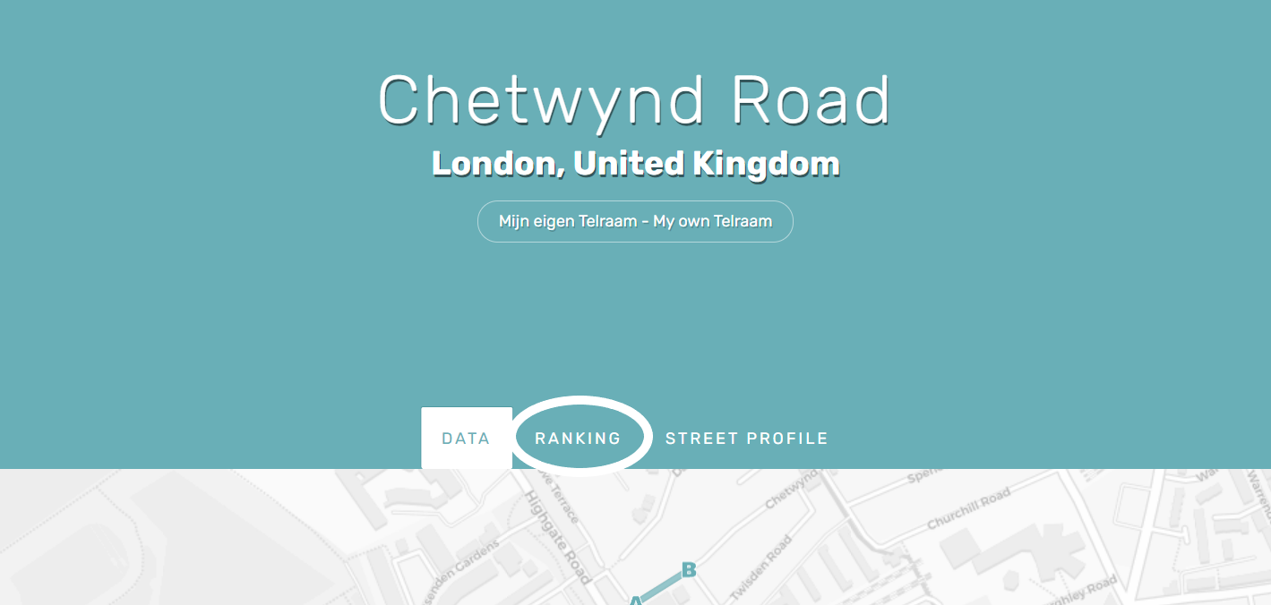
This will take you to the page containing all the data collected by your Telraam. On this page, you will find the ranking option:
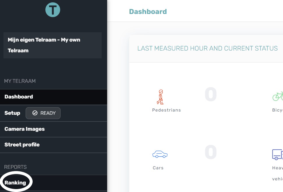
- Via your Dashboard:
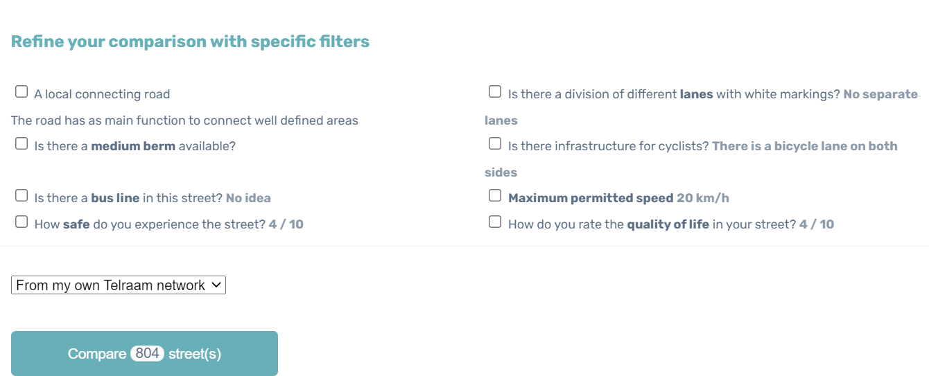
From your dashboard, you can then refine the comparison of streets with specific filters:
How do I use ranking?
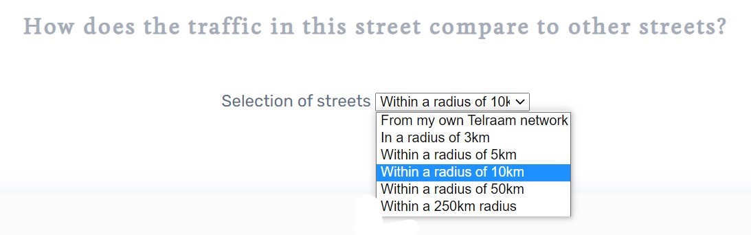
On the ranking page, you can select the streets with which you want to compare your street segment. You have six options:
- Comparison with streets that belong to the same network as your street segment
- Comparison with streets within a radius of 3, 5, 10, 50 or 250 km
Various ranking results
Once you have selected your comparison option, the ranking results will be generated.
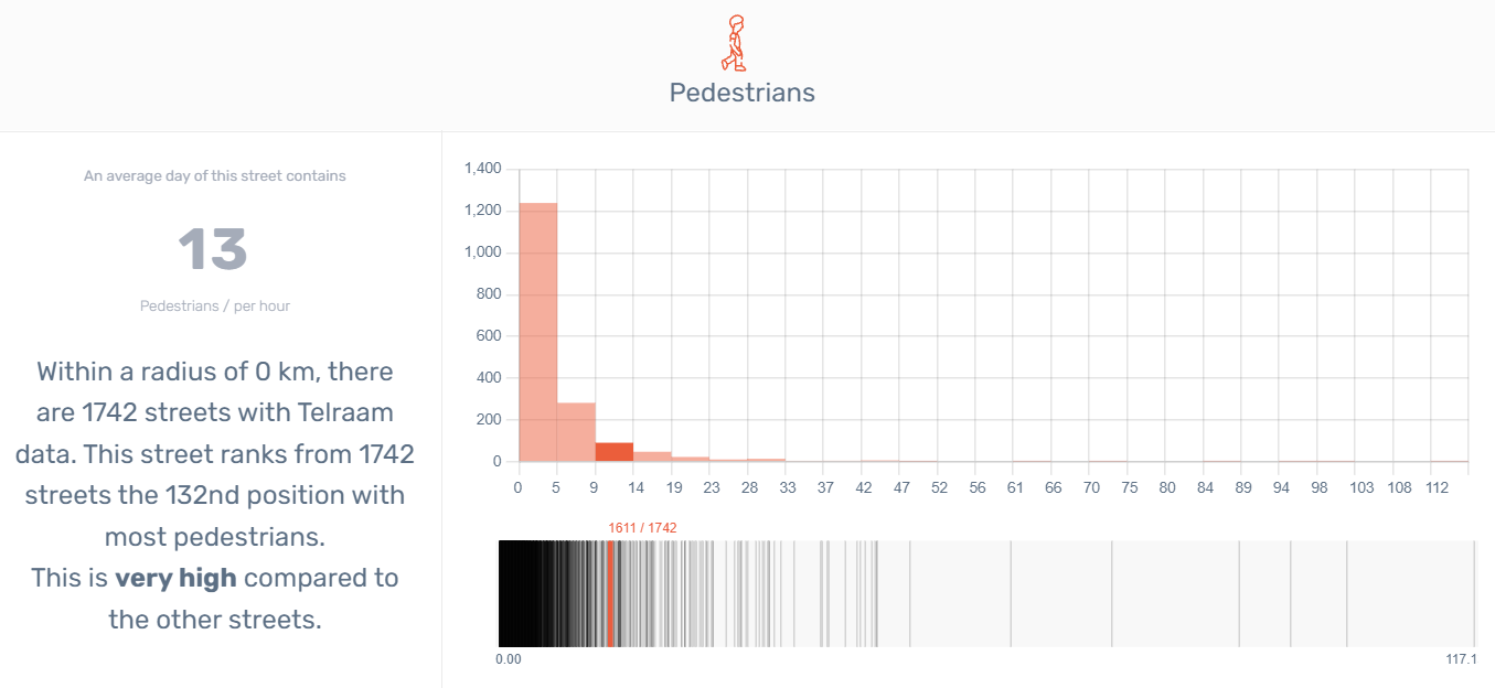
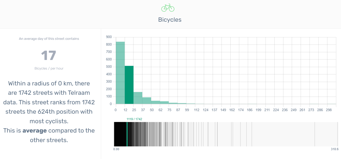
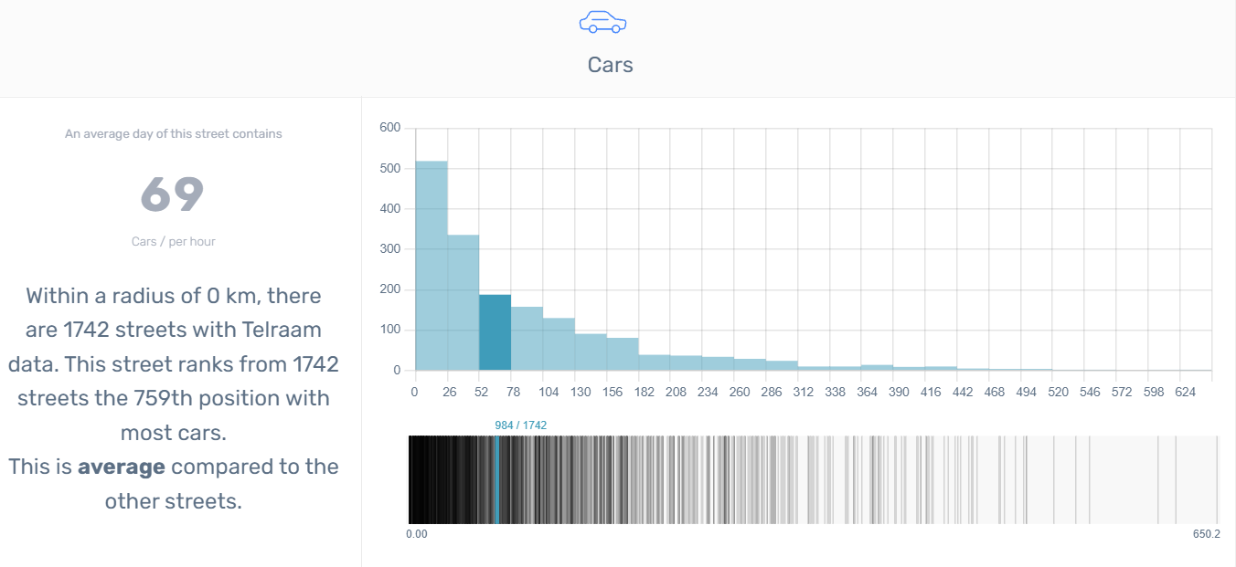
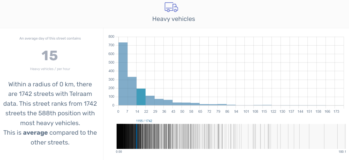
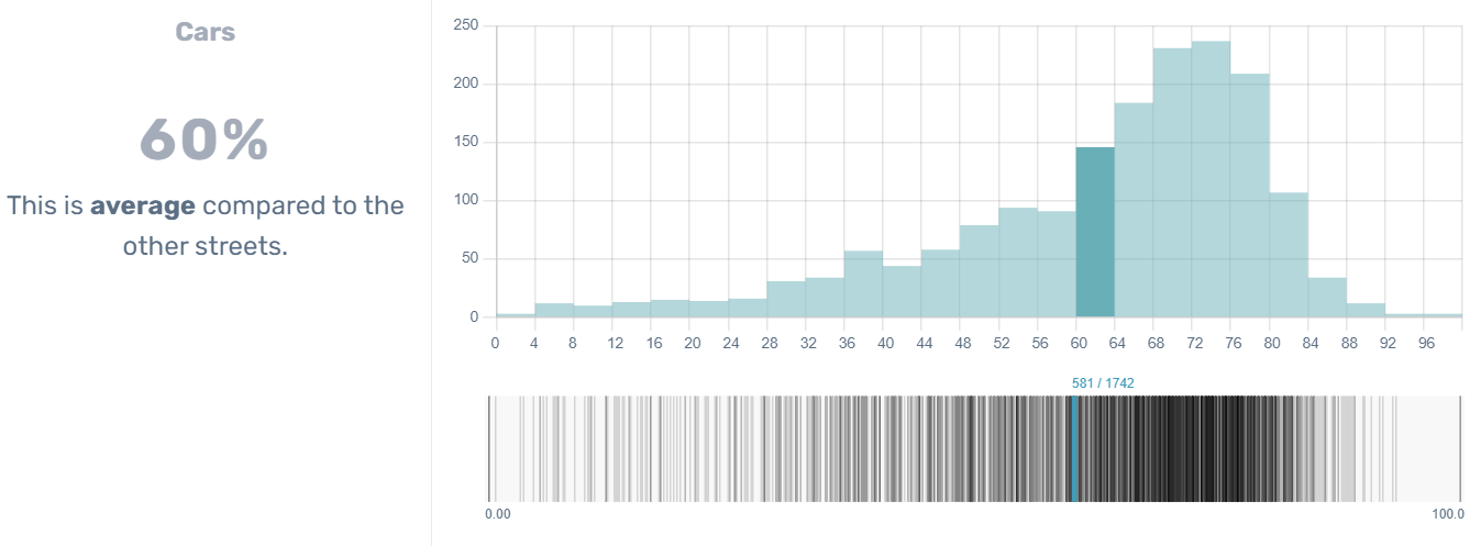
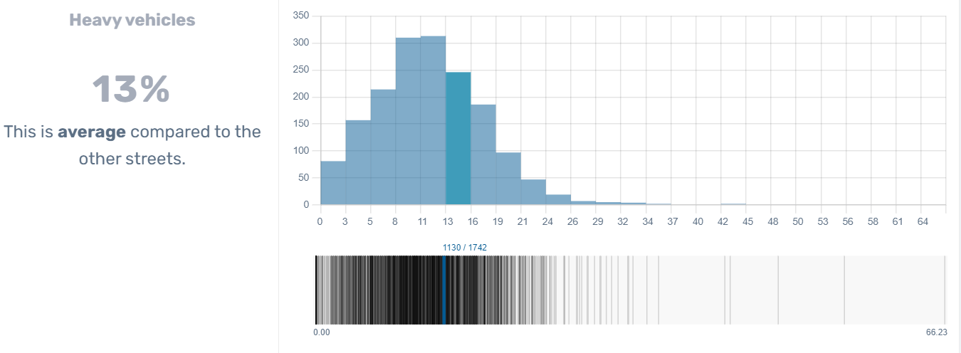
1. Ranking of your street based on the average day count by type of vehicle
On the left side of the screen you have an overview of the average number of pedestrians on your street and a summary of the comparison with other streets (very high, high, medium, low, or very low).
On the right side of your screen, you have two tables.
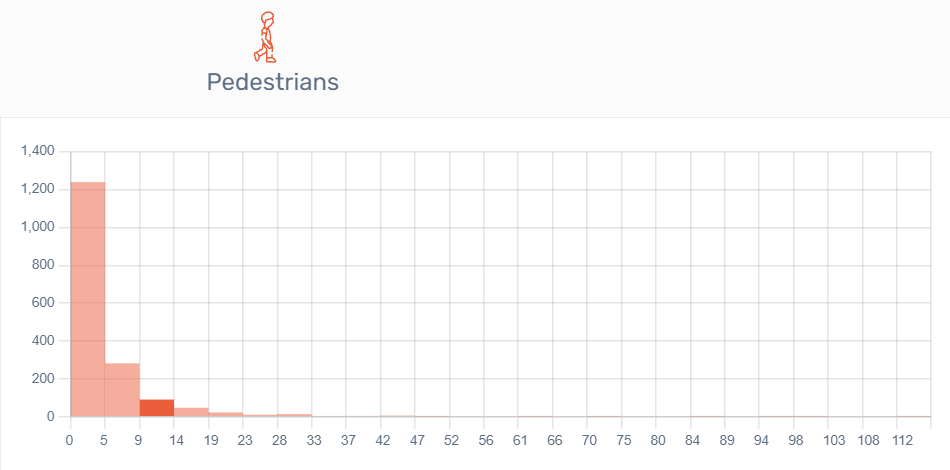
1.1. A histogram
In statistics, a histogram is a type of graph that shows the frequency distribution of data, usually in the form of vertical bars. This type of graph is also called a frequency histogram, and sometimes a bar graph. In a histogram, the height of each bar indicates the number of items in that range of the graph. Histograms are often considered the most important tool for studying the distribution of data.
Your street appears in red on the graph.
1.2. A barcode plot
On this graph, the data for each of the streets included in the comparison are sorted by size. You can see the results for other specific streets by hovering your cursor over the graph. Data is provided for all vehicle types (pedestrians, cyclists, cars and large vehicles).
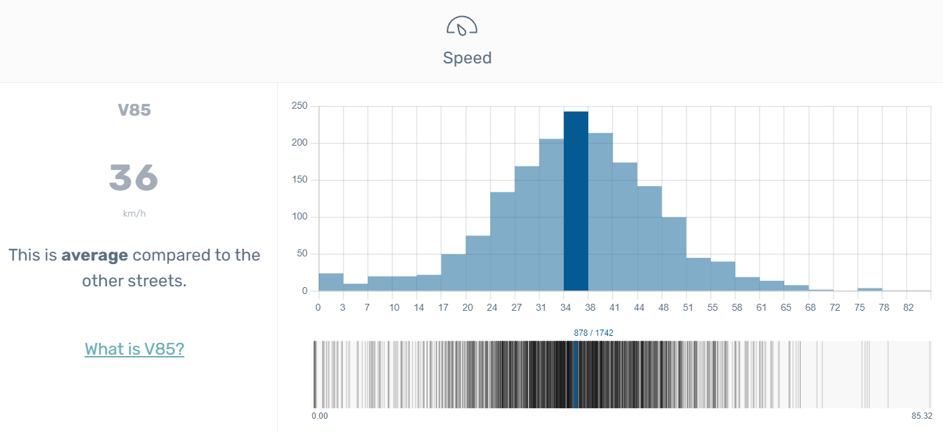
2. Speed results
Further down the screen, you can see the results of the comparison related to the speed of vehicles.
2.1. V85
On the top histogram, you will find the average speeds recorded on the x-axis (horizontal) and the number of Telraams that recorded this average speed on the y-axis (vertical). To learn more about the V85, click here.
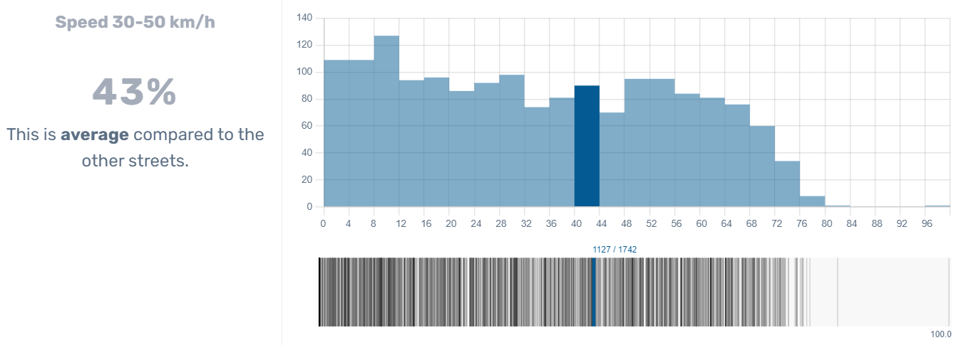
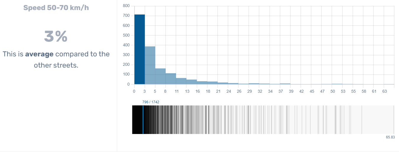
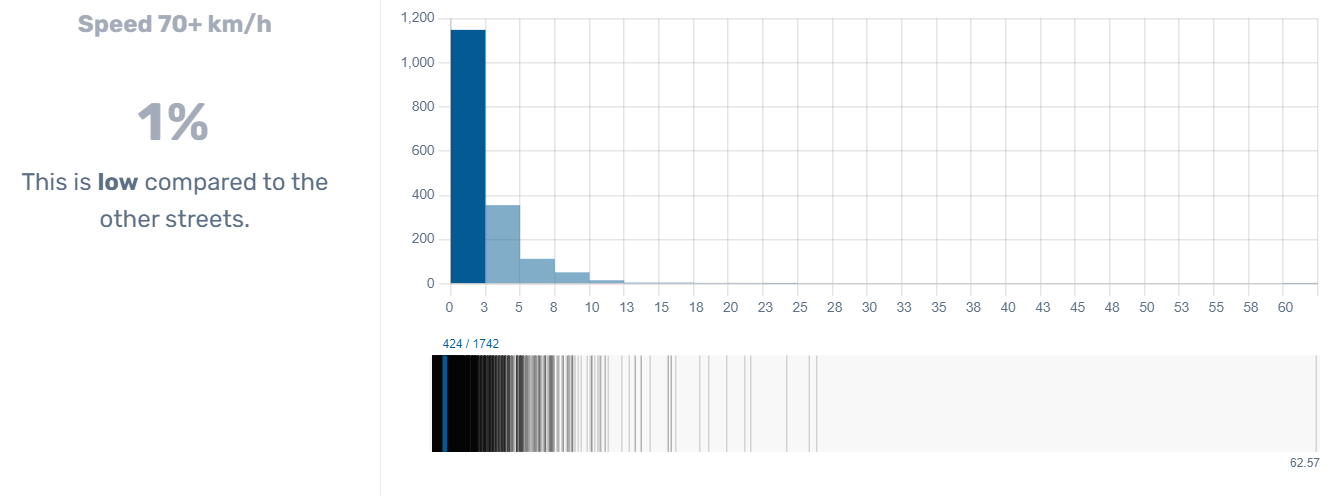
2.2. Results by speed interval (30-50 km/h, 50-70 km/h, 70+ km/h)
On these histograms, the x-axis (horizontal) indicates the percentage of vehicles recorded for the given speed interval and the y-axis (vertical) indicates the number of road segments that recorded the same percentage.
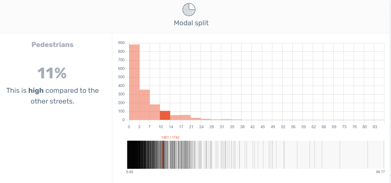
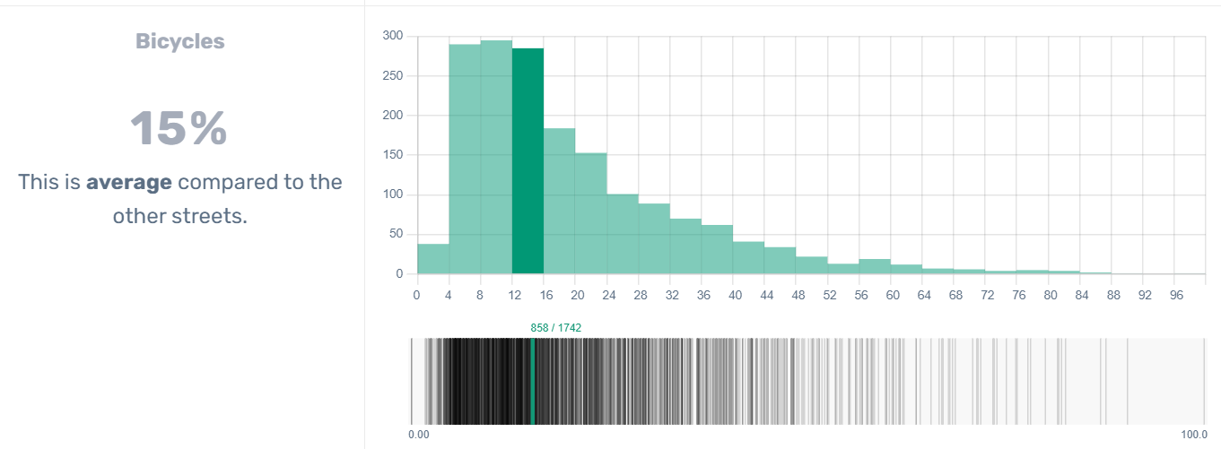
3. Modal split results
Here you get the percentage of registered vehicles by modality type (percentage on the x-axis, number of Telraams on the y-axis).
There you go: now that you have some basic info about raking results, you can start playing around with the data. Have fun!