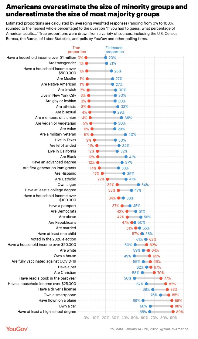
This is a fascinating graph, and discussion, around the topic of data, in this case demographic data for the US, and how our perceptions can often be skewed.
Check out the graph below, with “guesses” in blue and “actual” (within limits) in red.
You can also read more about the study on the yougov site here:
So many fascinating issues in a general sense - like, did you spot that more Americans own a car than have a driver’s licence?  Shame they never asked about bike ownership …
However, this bias in our guessing is something to keep in mind for any discussion about local traffic, and traffic impacts as well. We may over or under-estimate pictures depending on how ubiquitous it is, and how extreme our personal experience of it is.
Sadly, as the article points out, it isn’t enough to point out these discrepancies in order to get a person (or organisation) to change their mind … but hopefully having the data means we can base our decisions on “red” dots not “blue” ones 