As you know, Telraam is all about Open Data. For those of you who are comfortable working with our API, here’s a few examples of Telraam data integrated in own dashboards.
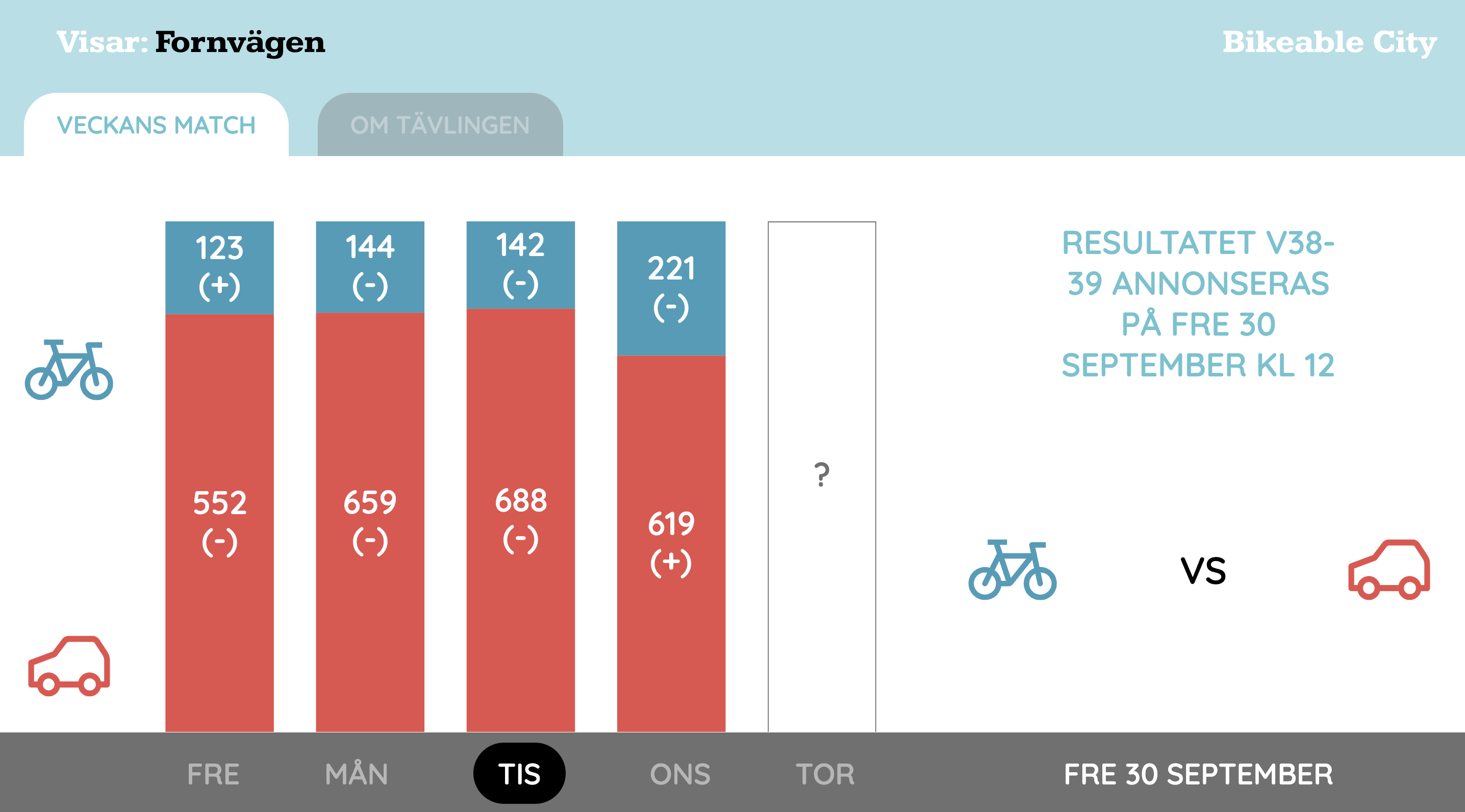
One example is this one from Sweden. It’s a simple dashboard, calling our API, with a different way of presenting the data.
Another, more extensive one, is this one from Liège. In this example, Telraam data is aggregated and integrated with other mobility data.
I’m pretty sure there’s many more examples out there. If you find more examples or -even better- if you made one yourself, please share here! 
1 Like
I really love that Swedish example. What is great - if I understand it correctly thanks to some automatic Google translation - is that they are not only showing the Telraam data in a new way, but instead of reporting it, they have turned it into a competition.
I love the idea of re-purposing the data to show which mode (cars vs bikes) is most popular - i.e. has grown as a percentage of total traffic - this particular week. It motivates the readers to be involved, not just to read numbers of things that have already happened.
What a great project! I wish I knew anything about API programming to try and do something with my camera’s data too … maybe someone here will be able to help
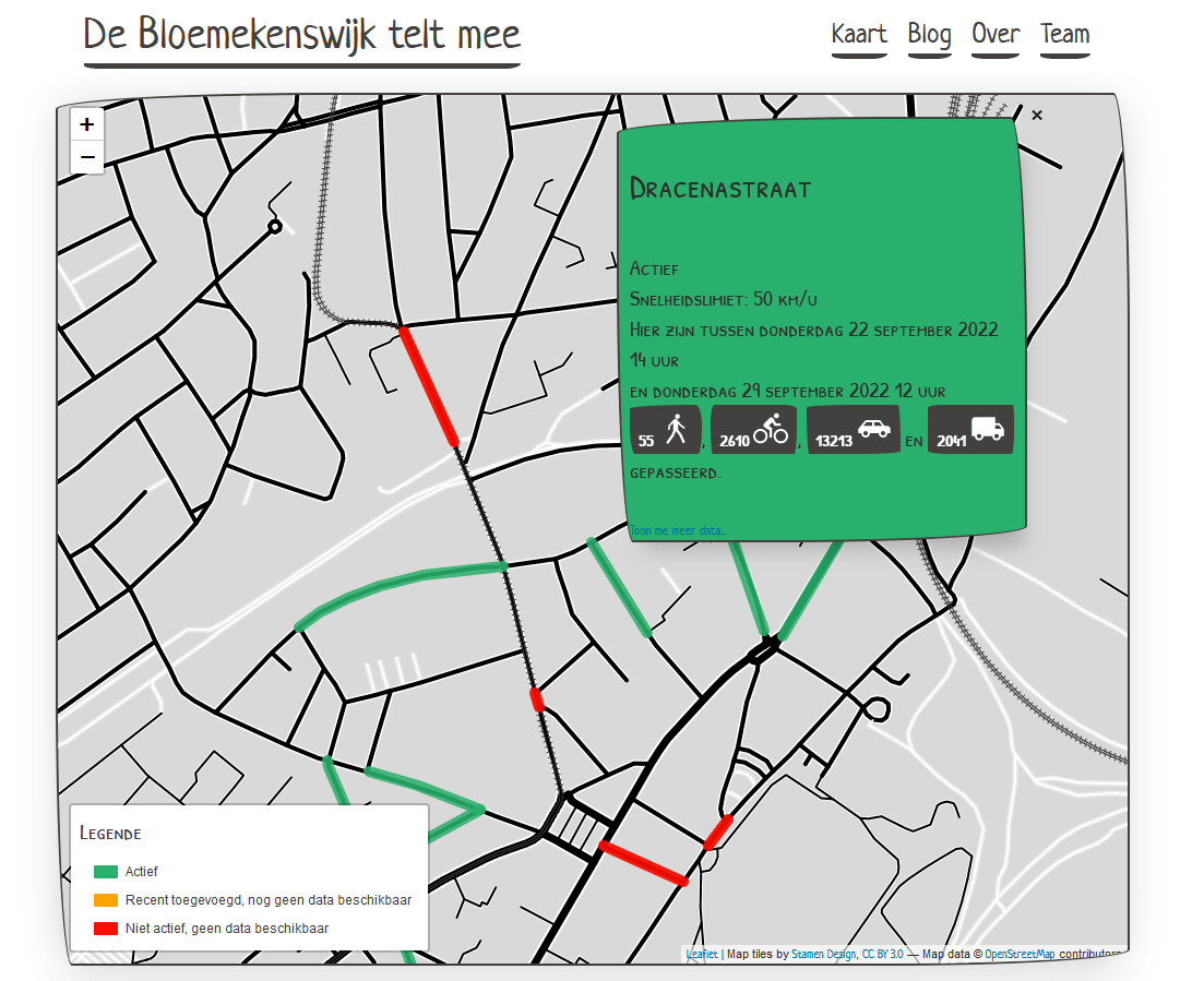
Another (more playful and less dashboard) example is this one :
https://www.bloemekenswijk.be/
2 Likes

I love that! I see it even has some toggles.