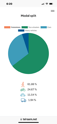
It would be really useful if the dashboard’s Modal Split chart would recalculate the displayed percentages based on the user’s selection.
When you toggle the categories displayed, it redraws the pie chart but the percentages displayed don’t match the redrawn chart.
