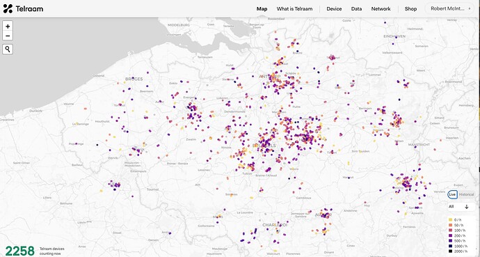
Noticed something new on the Telraam map?
If you’d visited this view a few days ago, there would have been quite a few grey dots making it harder to see the many active devices across the countries.
Devices that had counted on road segments were always shown alongside current live data so that the historic information was available to users even after the counting had stopped. However, it made the map busier, and slower, than it really needed to be.
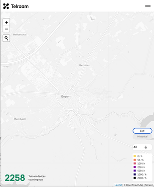
We’ve now added a toggle (see above the index on the bottom right) so you can change between the “Live” counts, and the “Historical” data.
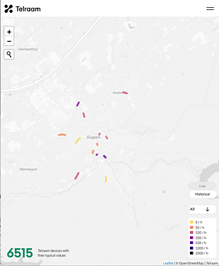
To make this even more useful, this historic view is not just a list of reference points and segments, but will show the ‘typical’ traffic volume (by colour) for that segment for this day and time.
Now, if you’re looking at a town where we used to capture new data but we no longer do, you can still get an idea of how busy that road segment would be today.
See this side-by-side example in Eupen:
I hope you find this new view of the Telraam data interesting, and that the map on our homepage is even more useful to you.
Please tell us what you think about this, and maybe you have your own suggestions of other ways we can display our data.


